
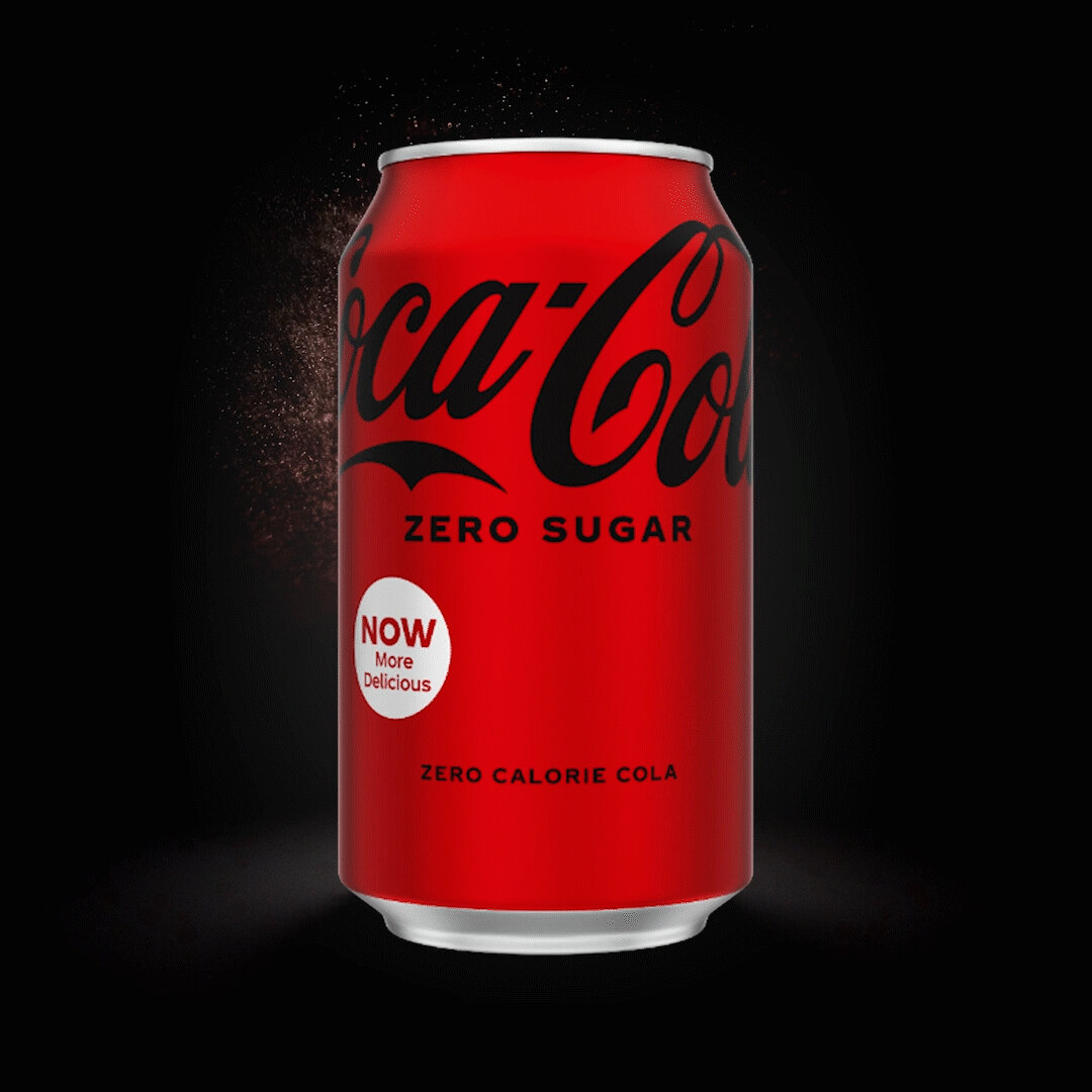
I re-stocked the sodas at work this afternoon and noticed Coke Zero has a new design. The can is now red with a black logo, which makes things visually confusing when they’re sitting next to each other in the cooler. But the best new addition to the design is a circular emblem that proudly declares the beverage is “Now More Delicious!”
How does one measure deliciousness? Isn’t that a subjective thing? I mean, I drink Coke Zero, but only because of the calories. The deliciousness of the drink doesn’t really factor in for me. When you drink a diet soda, you know what you’re tasting: disappointment.
It takes a lot of balls to print something like MORE DELICIOUS on 100 million cans. Does this kind of marketing really work? Is someone perusing the soda aisles and going “well shit, I liked Coke Zero before, but now it’s MORE delicious? I gotta get this!”
I mean, I guess it does, because after staring at the cans in the fridge for four hours of my shift, my curiosity got the best of me, and I cracked one open.
I can’t say my experience was more positive than normal. I could tell they’d made a slight adjustment to the formula — a little less bite and a little more tang — but more delicious? That’s a stretch.
But when you’re the largest soft drink company in the world and your name is more recognizable than if LeBron James married Taylor Swift, I guess you get to make the rules. The New Coke debacle of 1985 long in the rearview, they’re back to telling YOU what’s delicious. Deal with it and pour this chemical cocktail down your throat, fatty.
